Design system migration

Migrating FINRA's design system
from Adobe XD to Figma.

With an unfunded, volunteer team, we moved FINRA UI from Adobe XD to Figma, rebuilt it as a token-based atomic system, and documented it on a live guidebook site.
Role
Product designer
Timeline
12 months
Team
8 volunteer designers
Users
Designers, PMs & engineers
Tools
Figma, Adobe XD, Miro
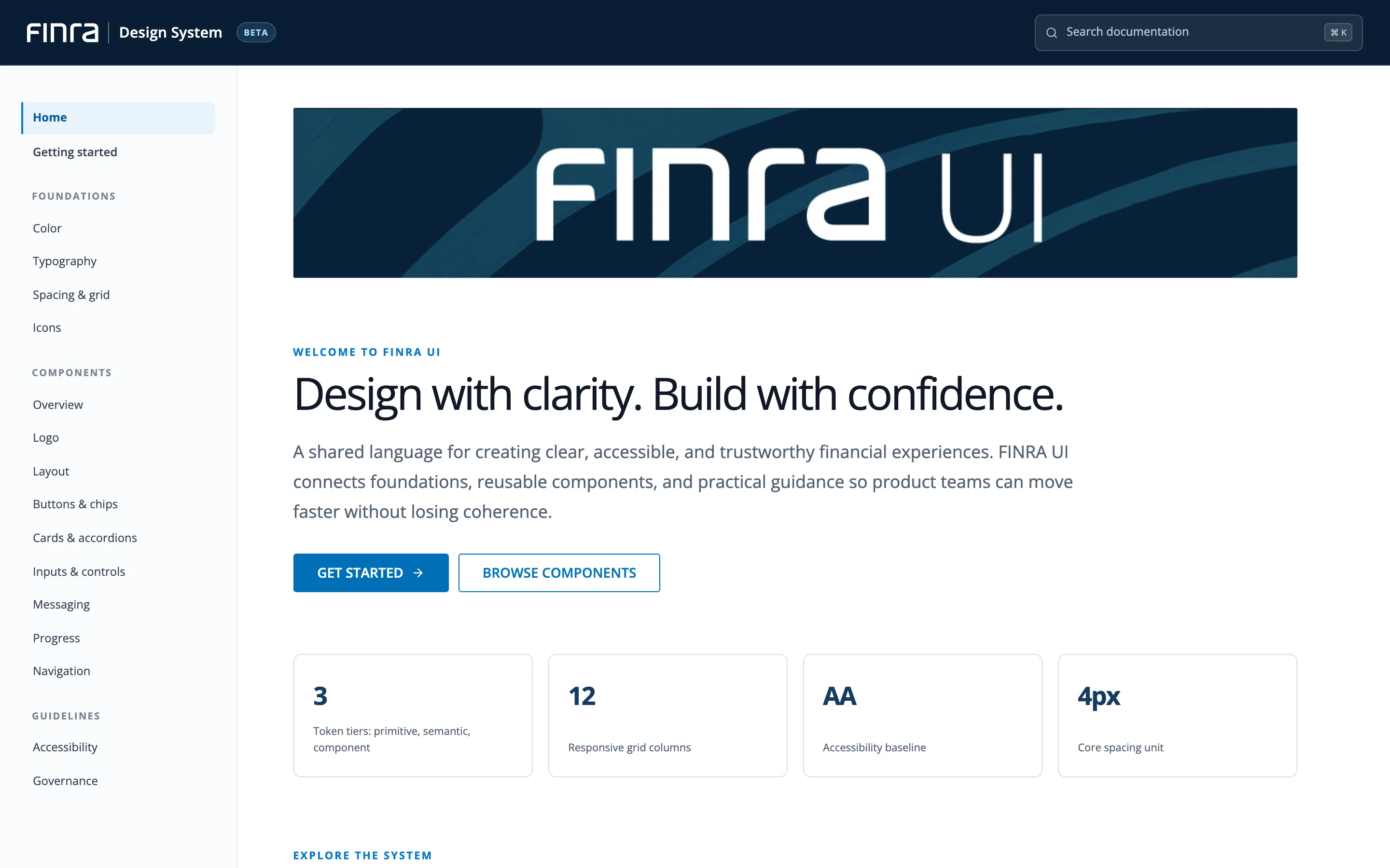
FINRA UI design system home page: Design with clarity. Build with confidence.
In a nutshell

The 30-second version

For recruiters, hiring managers, design and product leaders, and anyone reading between meetings.

01 · The users

Everyone who
builds FINRA apps.

  • Designers, product managers and engineers
  • One library behind a suite of financial-industry apps
02 · The problem

A library that
couldn't keep up.

  • Broken links and outdated libraries
  • Handoff through XD spec links, updated by hand
  • Accessibility rules undocumented
03 · My role

Product designer
on a volunteer team.

  • One of 8 designers on the Figma migration team
  • Worked with the design lead, PM, engineers and researchers
04 · Key move

Migrate by
rebuilding.

  • Moved the system from Adobe XD to Figma
  • Rebuilt as atomic components, not one-for-one copies
  • An open contribution modelAnyone on the team can suggest a change to the design system. A small core group reviews each idea and decides whether to add it. to keep it current
05 · The outcome

58 accessible
components.

  • Built to best practices and WCAG 2.1
  • 105 styles defined
  • 20+ designers trained to build and contribute
01. Context & challenge

A fragile library, a volunteer team, no budget

FINRA UI is the shared hub of components and guidelines for FINRA's designers, PMs and engineers. In Adobe XD it had broken links, inconsistent handoffs and no written accessibility rules.

01 · The library

Collaboration bottlenecks

  • Broken links and outdated libraries
  • Inefficient handoffs to engineering
  • Undocumented accessibility standards (WCAG 2.1Web Content Accessibility Guidelines 2.1: the standard for making web content usable by people with disabilities.)
02 · The team

Mixed Figma experience

  • Designers knew Figma to very different degrees
  • The migration had to double as a shared learning experience
03 · The budget

No dedicated funding

  • A non-funded, volunteer initiative
  • Every hour had to count, so the plan had to stay useful at every stage
Industry context Why Figma, not Adobe XD Show detailsHide details
01 · Handoff

One live file for handoff

  • Developers inspect the real design file
  • They get measurements, code and assets in one place
  • Works even with a free view-only seat1
  • XD used separate spec links, updated by hand2
02 · Industry

Where the industry was going

  • Figma ranked #1 for UI design and design systems
  • 91% of designers used it for prototyping
  • Based on a 2022 survey of 4,260 designers3
  • Adobe agreed to buy Figma for about $20B in Sept 20224
03 · Confirmed later

XD stopped moving forward

  • May 2023: Adobe put XD in maintenance mode5
  • No new features
  • No longer sold as a standalone app

1 Figma pricing FAQ  ·  2 Adobe: Share design specs in XD  ·  3 UX Tools 2022 survey summary  ·  4 Adobe press release, Sept 15, 2022  ·  5 The Register, Jan 2024

How might we

move our design system to Figma smoothly, and keep designers and engineers working together the whole way?

02. Approach

Rebuild from the smallest parts up

Instead of copying XD files, we adapted Brad Frost's atomic design, studied how Google, Apple and Atlassian organise their systems, and rebuilt in phases.
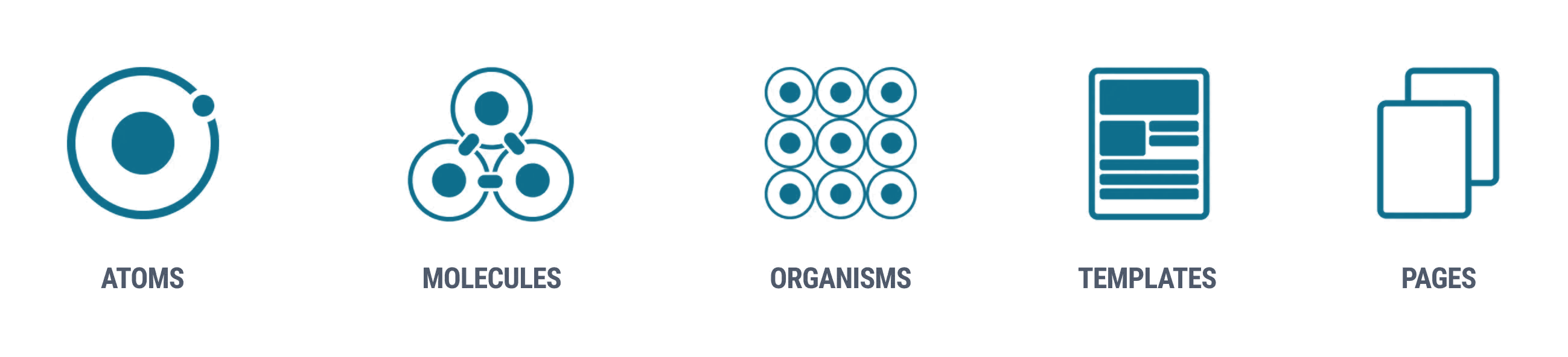
Atomic design: atoms, molecules, organisms, templates and pages

Atomic design, adapted. Atoms, molecules and organisms live in the system. Templates and pages stay in each product. Source: Brad Frost, Atomic Design.

Step 01

Inventory

Listed every XD component and turned it into a migration backlog.

Jun – Sep 2022
Step 02

Foundations

Colour, type, spacing and grid styles, defined once.

Oct 24, 2022
Step 03

Atoms → molecules

Built and QA'd the smallest parts first, then combined them.

Nov 14 → Jan 15
Step 04

Organisms → launch

Composed patterns, tracked on a shared Miro board.

Mar 6 → May 5, 2023
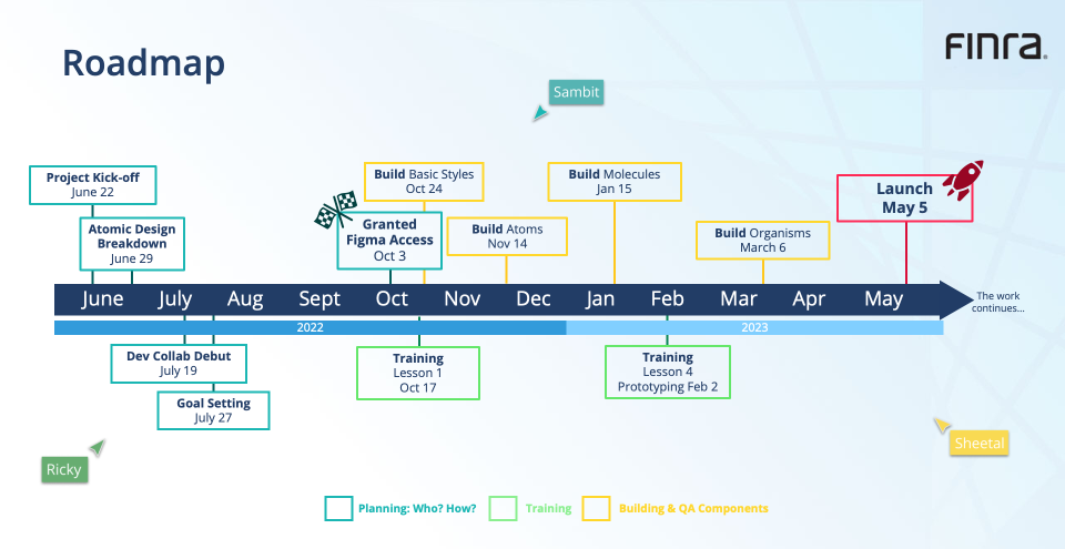
Project roadmapPlanning, training and building, side by side Show roadmapHide roadmap
Roadmap from project kick-off on June 22, 2022, through Figma access on October 3, styles, atoms, molecules and organisms, to launch on May 5, 2023
03. Token architecture

How one button is built from tokens

Every FINRA UI component resolves to the same foundations. Here's the primary button from the live site, traced back to its tokens.

Primary button · 40px · the only supported size
Color
Button → semantic
  • button.primary.bg→ color.action
  • button.primary.bg-hover→ color.action-hover
  • button.primary.text→ color.on-action
  • button.disabled.bg→ color.disabled-surface
Primitives · FINRA palette
102030405060708090100
  • Blue 70#0070B7
  • Slate 70#233E66
  • Slate 20#E9EBEF
  • Gray 10#FFFFFF
8 families × 10 steps, named as in the Figma library. White on Blue 70: 5.25:1, AA.
Spacing
Button → semantic
  • button.height→ control-height
  • button.padding-inline→ space-600
  • button.gap→ space-200
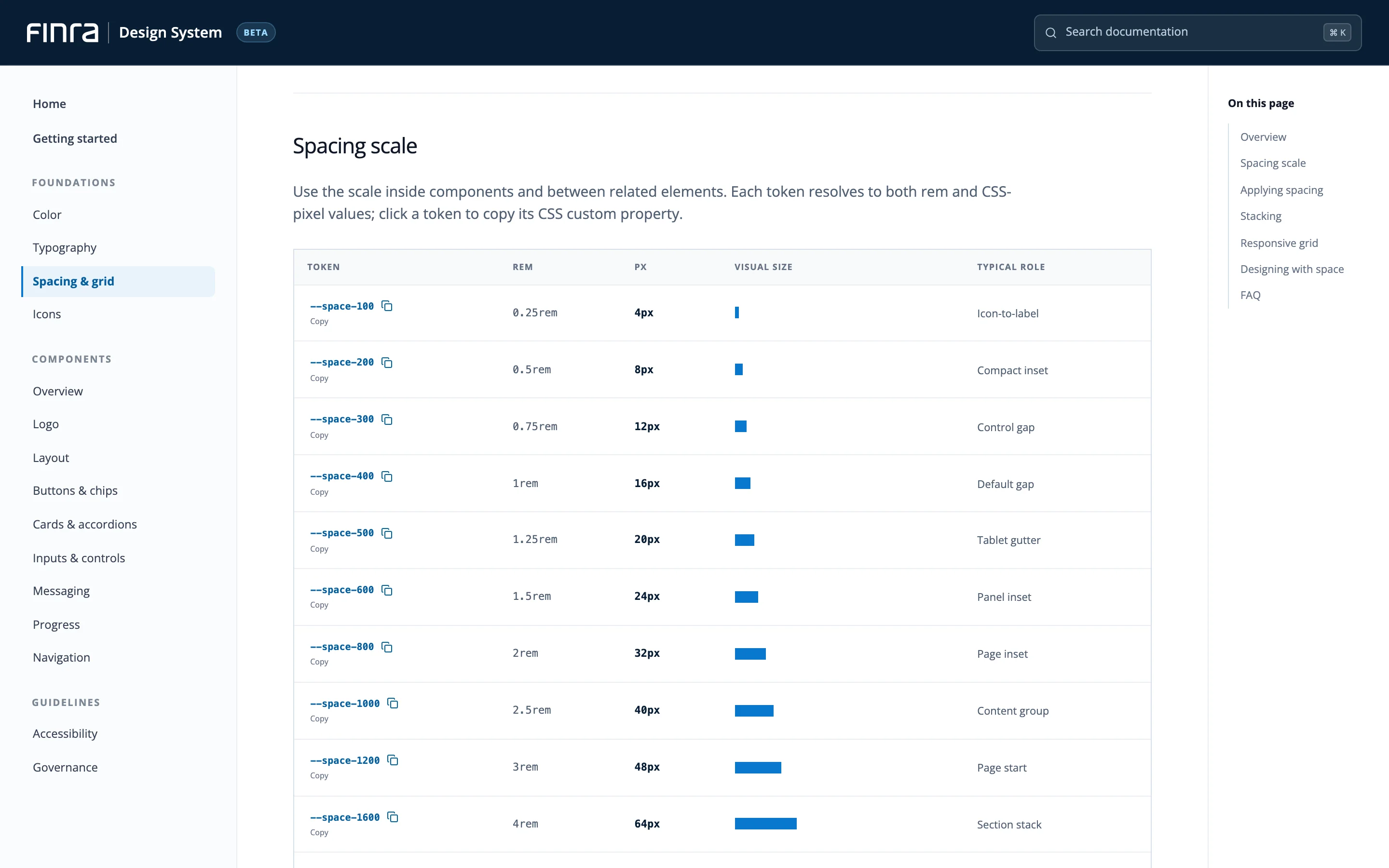
Primitives · 4px scale
space-1004px
space-2008px
space-30012px
space-40016px
space-50020px
space-60024px
space-80032px
space-100040px
There's no vertical-padding token. The height is fixed at 40px and the label is centred.
Typography
Button → text style
  • button.font→ type.button
Approve
  • fontOpen Sans
  • weight600
  • size/line14/20
  • caseUpper
Primitives · type scale
Heading 132/40
Heading 224/32
Heading 318/28
Paragraph16/26
Button14/20
Table label12/16
Shape
Button → semantic
  • button.radius→ radius-control
  • button.border-width→ border-width
Primitives · shape
radius-100
3px
controls, cards
radius-full
999px
chips
  • border-1001px

Every value is a token in the guidebook's code, so changing Blue 70 once updates every button, tab, checkbox and focus ring that uses it. The tiers follow the W3C design tokens format, the model Adobe Spectrum and Material 3 use.

04. The system

A guidebook site for every decision

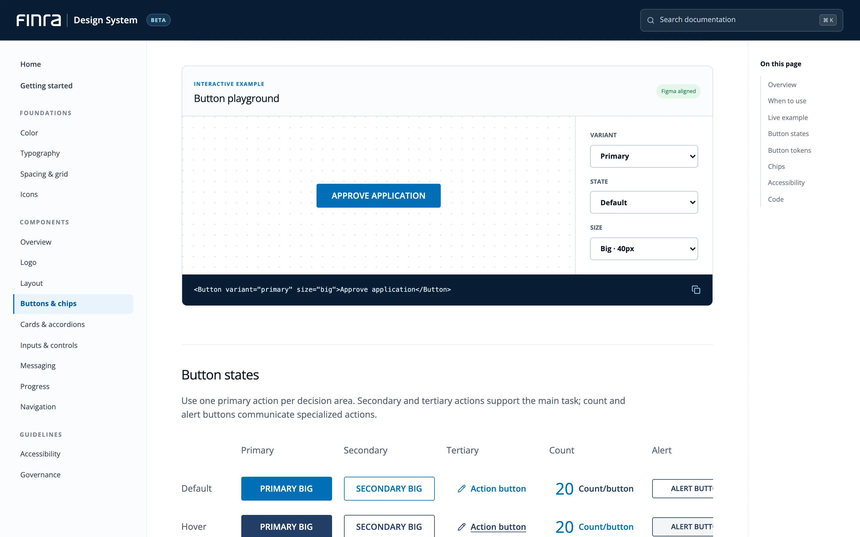
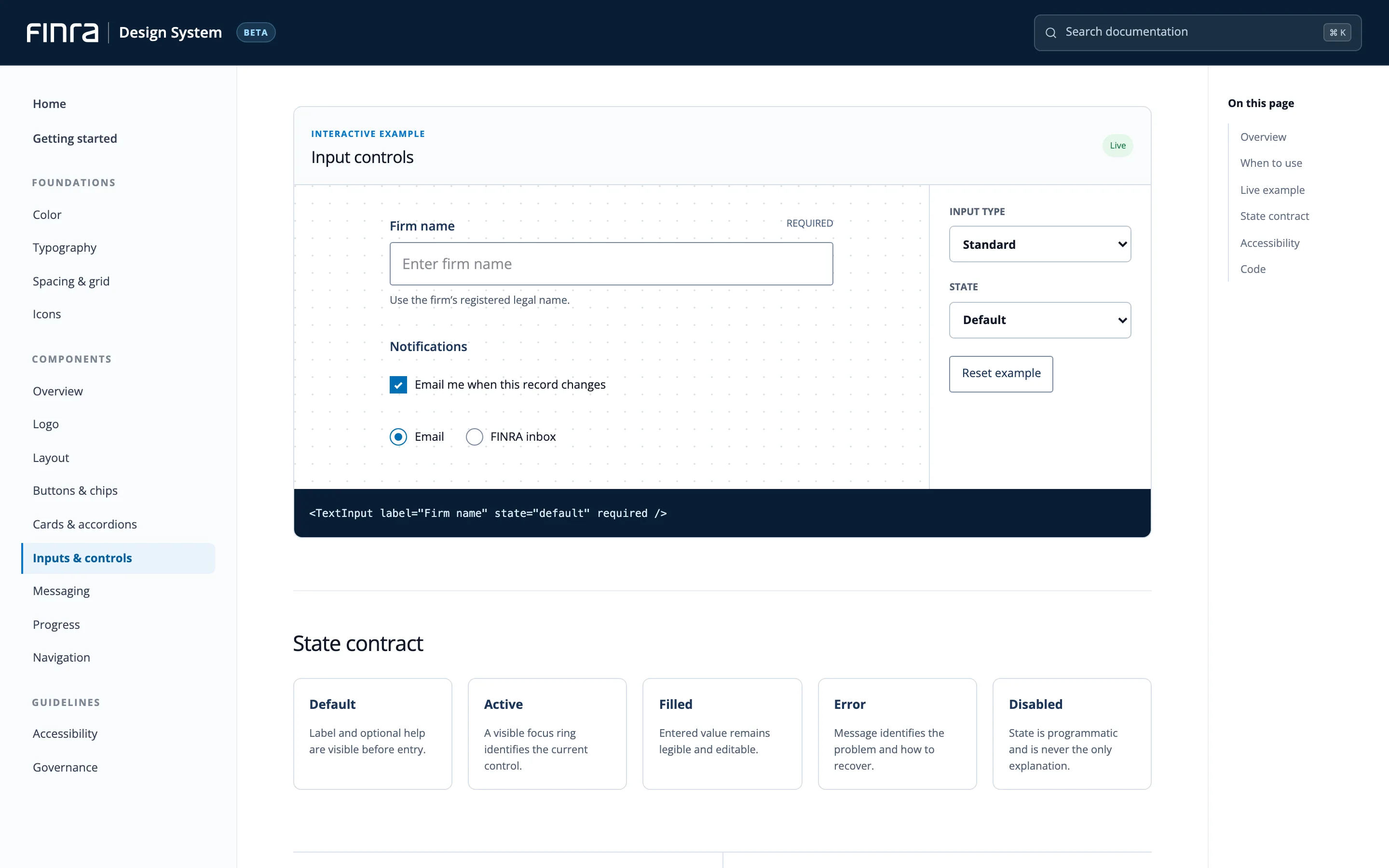
Each page shows when to use a component, its states, accessibility checks and code, so design and engineering work from the same rules.
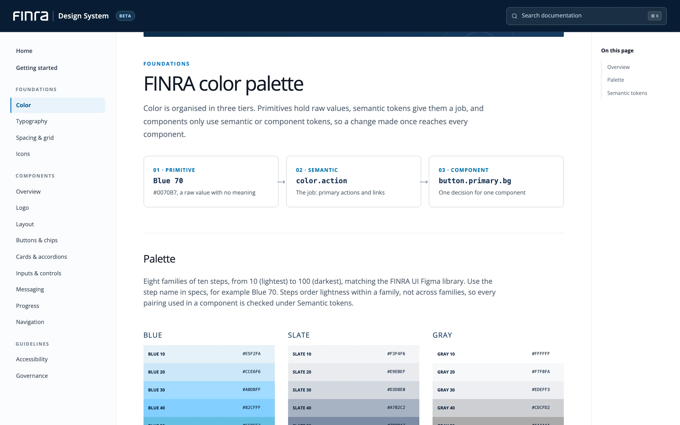
Home

One front door for the whole system

Foundations, components and guidelines in one place, with search.

FINRA UI design system home page with foundations, components and guidelines in the side navigation
05. Governance & adoption

Open to everyone, reviewed by a core group

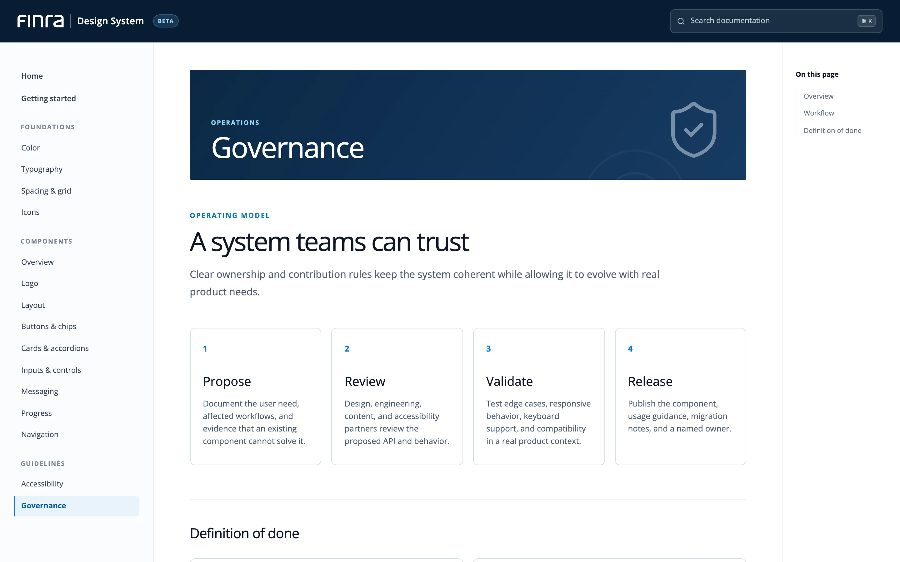
  1. ProposeAnyone opens a branch with the change.
  2. ReviewThe Design System Core meets bi-weekly to review it.
  3. DecideThe Core votes on the change.
  4. Hand offTickets go to engineering; the guidance is updated.
How 20+ designers learned it
  • Custom curriculum
  • 8 live sessions
  • Step-by-step lessons
  • Office hours
Governance page: propose, review, validate and release steps
06. Impact

What the team delivered

58
Figma componentsBuilt to best practices and WCAG 2.1.
105
Styles definedOne shared foundation for design and code.
20+
Designers trainedBuilding, handing off and contributing in Figma.
07. Reflection

The biggest lever wasn't a component. It was shared ownership.

01

Start fresh.

Our own standards beat recreating old XD habits.

02

Learn together.

Co-working taught Figma faster and built the team.

03

Plan for after launch.

Governance keeps the system improving.

Press Esc or click outside the image to close