State regulators (who work for the government)
They check applications from people who want to work in finance (e.g. financial advisors), then approve or reject them.
Modernizing a fragmented regulatory review process.
I redesigned how state regulators review financial-professional applications: bringing critical evidence, actions, collaboration, and audit history into one task-based experience.
For recruiters, hiring managers, design and product leaders, and anyone reading between meetings.
They check applications from people who want to work in finance (e.g. financial advisors), then approve or reject them.
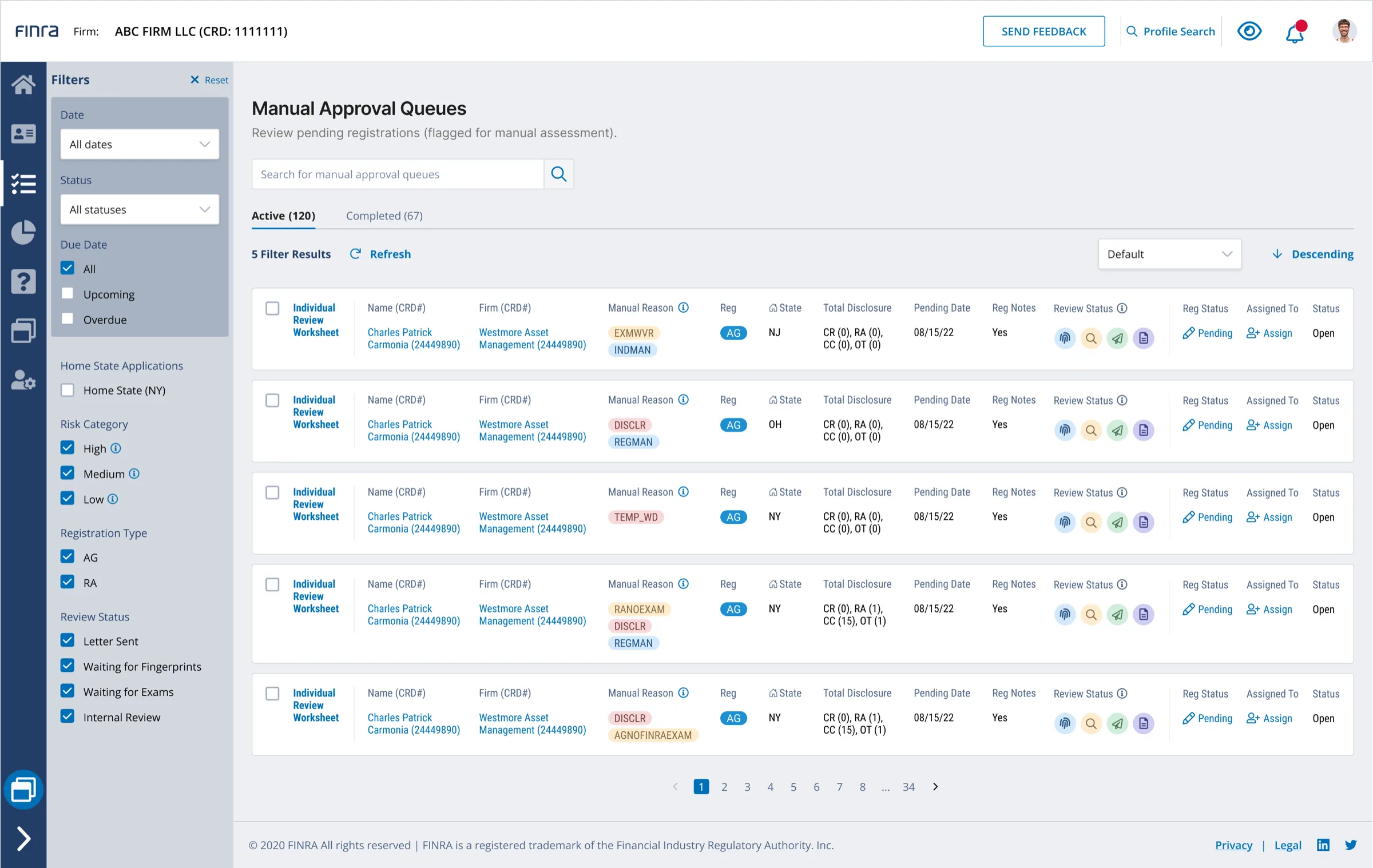
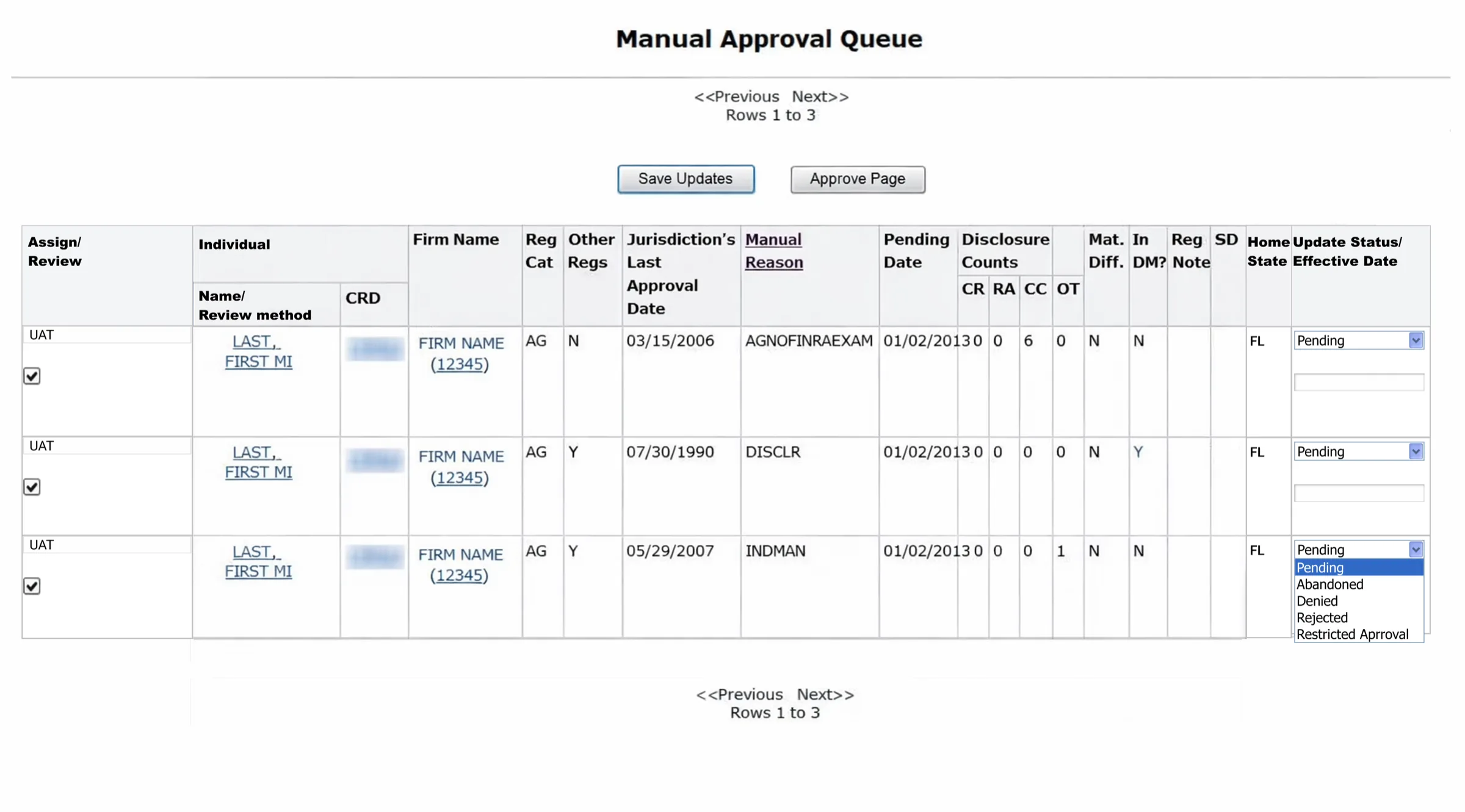
Regulators jumped across 5–7 pages and external documents just to understand one application.
I led the research, strategy, stakeholder alignment, interaction design, prototyping, and testing.
I brought context, actions, comments, rationale, and history together in one task-based view.
Navigation dropped from 5–7 tabs to 2–3, and errors fell below 10% during testing.
State regulators review financial-professional applications under fixed deadlines. During the Q4–Q1 renewal season, application volume increases by roughly 1.5×.
Regulators are audited. They would rather be slow than wrong.
State Regulator
I observed 12 state regulators during moderated, task-based sessions: 7 newer regulators and 5 veterans. That mix separated genuine usability problems from shortcuts experts had learned over time.
It was like keeping the spices in the bedroom and the vegetables in the garage. Everything was technically available, just never where the cooking happened.
With the PM and engineering lead, I mapped the system-generated path alongside manual-review edge cases, identifying the intended flow and the touch points where a straightforward review turns into a scavenger hunt.
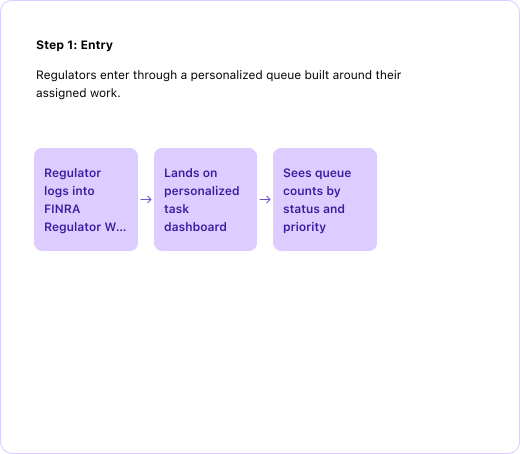
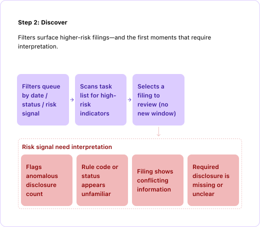
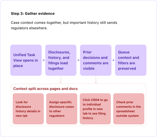
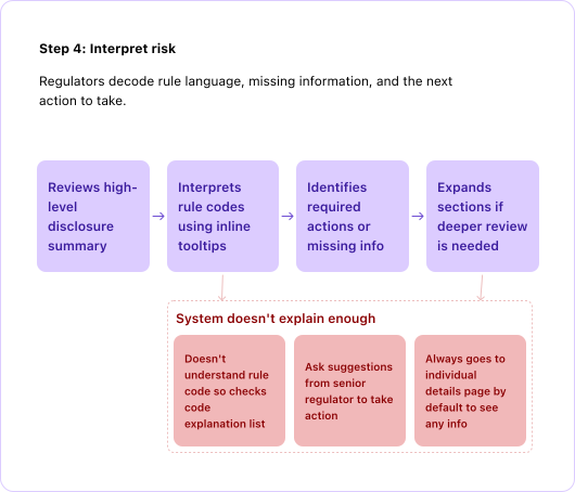
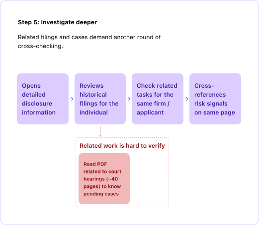
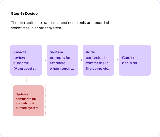
Instead of treating the legacy flow as one vague usability problem, I separated navigation friction, missing decision context, and gaps in the audit trail.
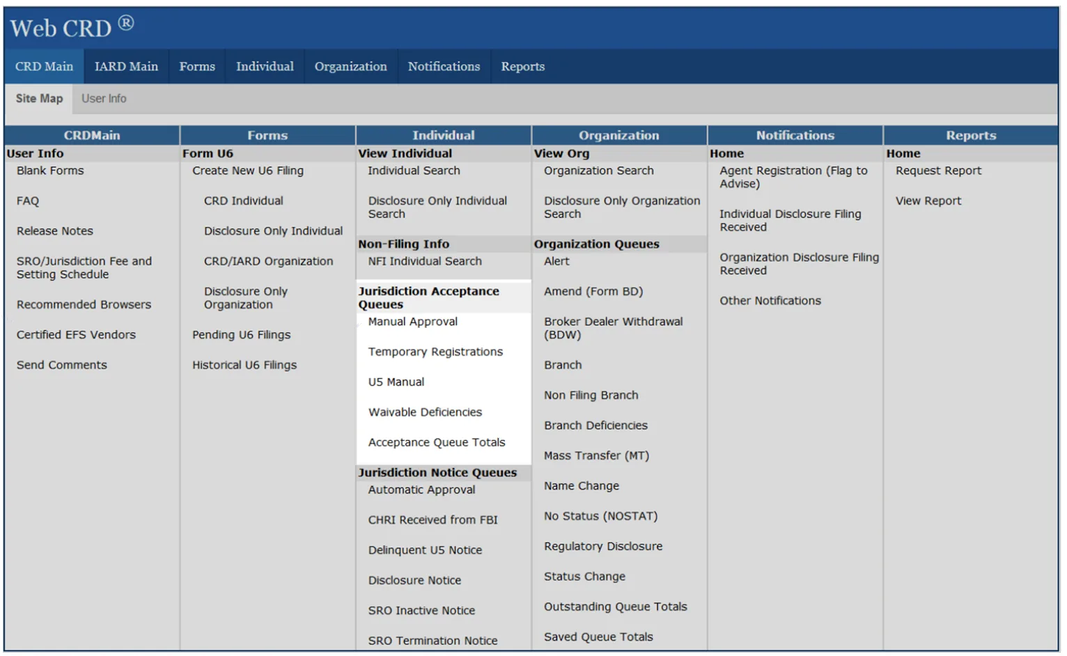
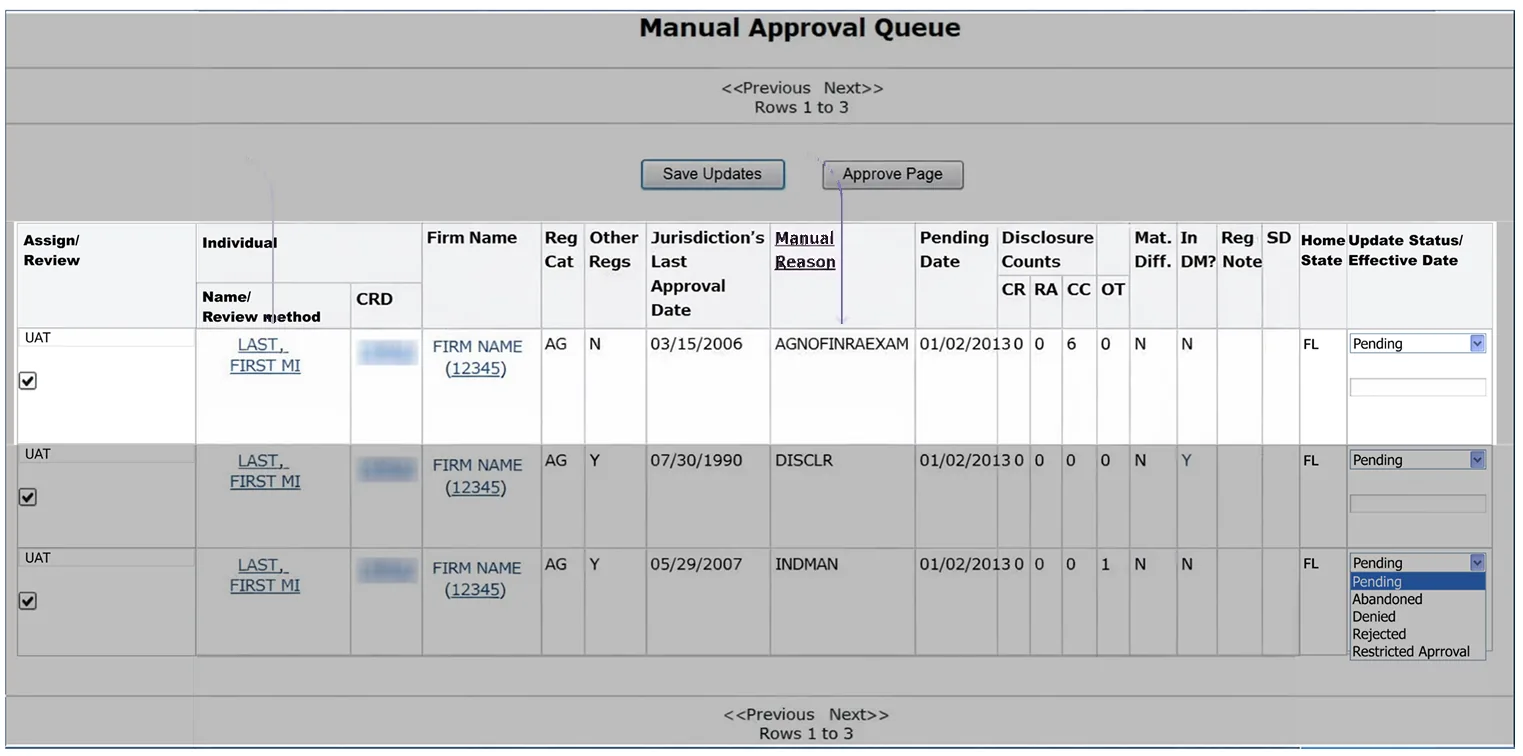
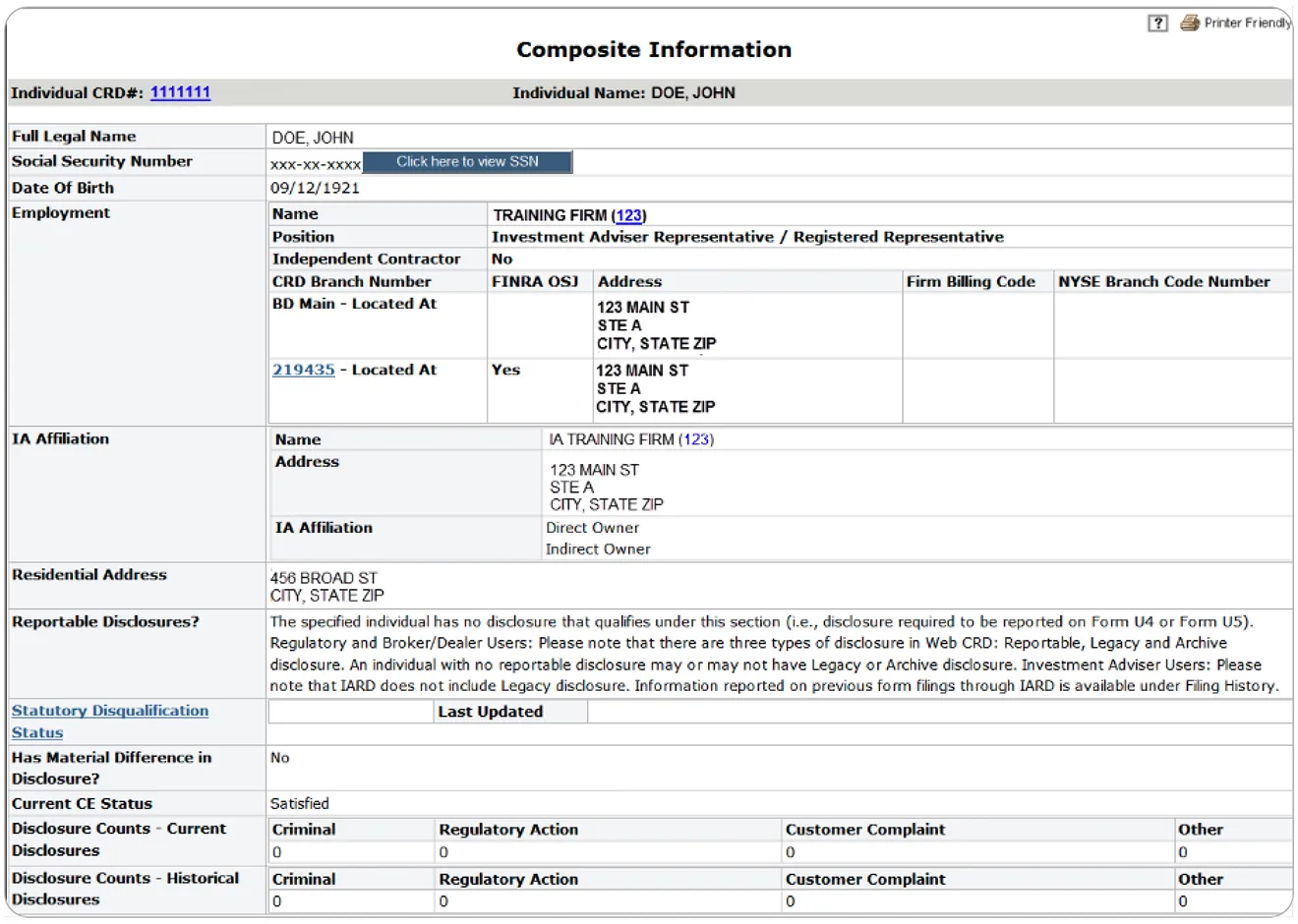
I translated the research into four measurable KPIs. Each connected an interface choice to a behavior the product needed to change.
Put related evidence inside one task view.
Surface history, prior actions & risk signals where decisions happen.
Replace page-based detours with a task-based structure.
Make terminology and next steps clearer without slowing experts.
An earlier iteration split task information into two rows. Veteran regulators lost their familiar left-to-right scan, while newer users found the dense context and error states unclear. Eye-tracking told us why.

Newer regulators searched broadly for orientation. Veterans focused on a smaller set of decision-critical fields. The design needed to support both without making either group slow down.
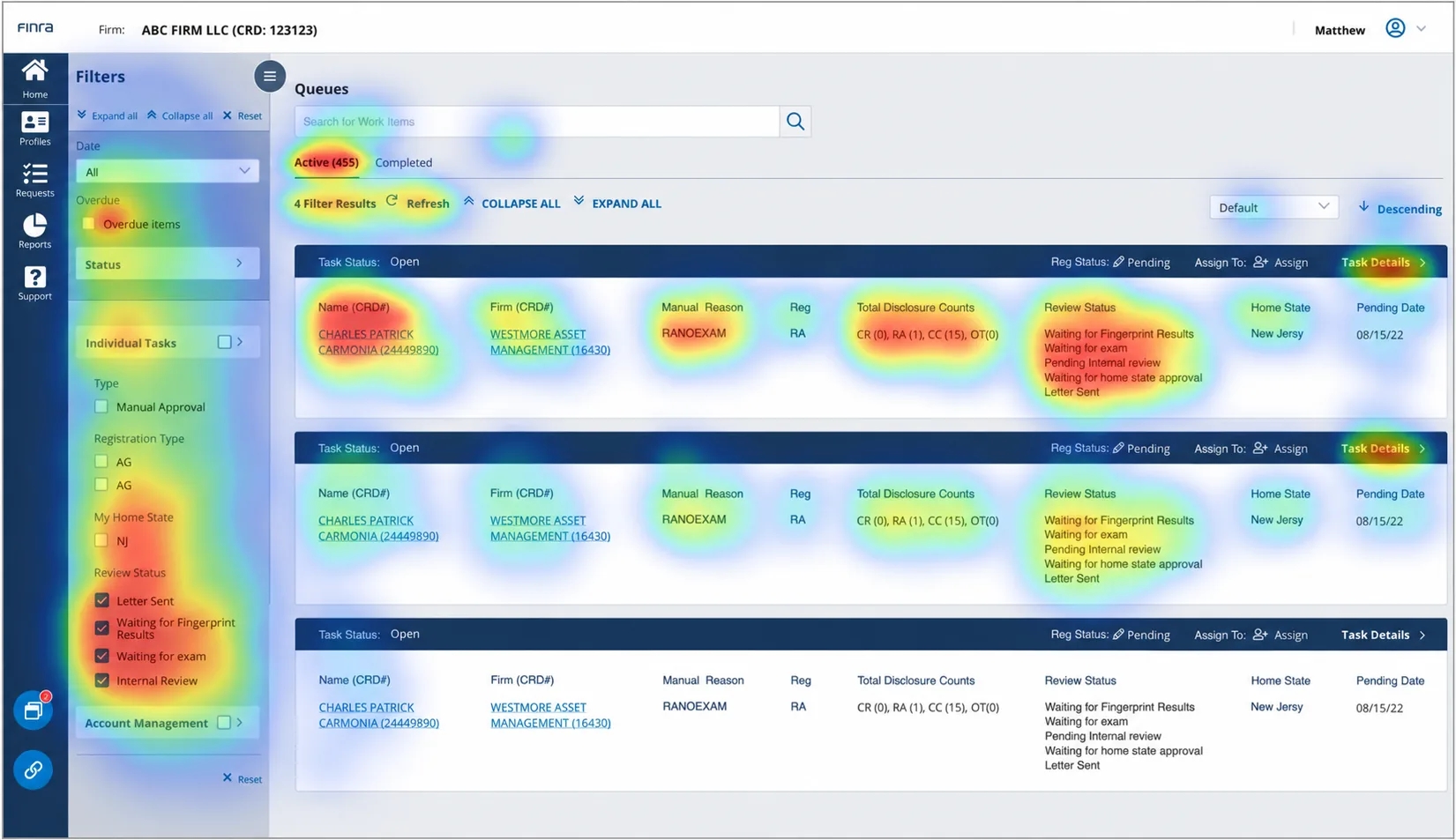
Broad, exploratory scanning
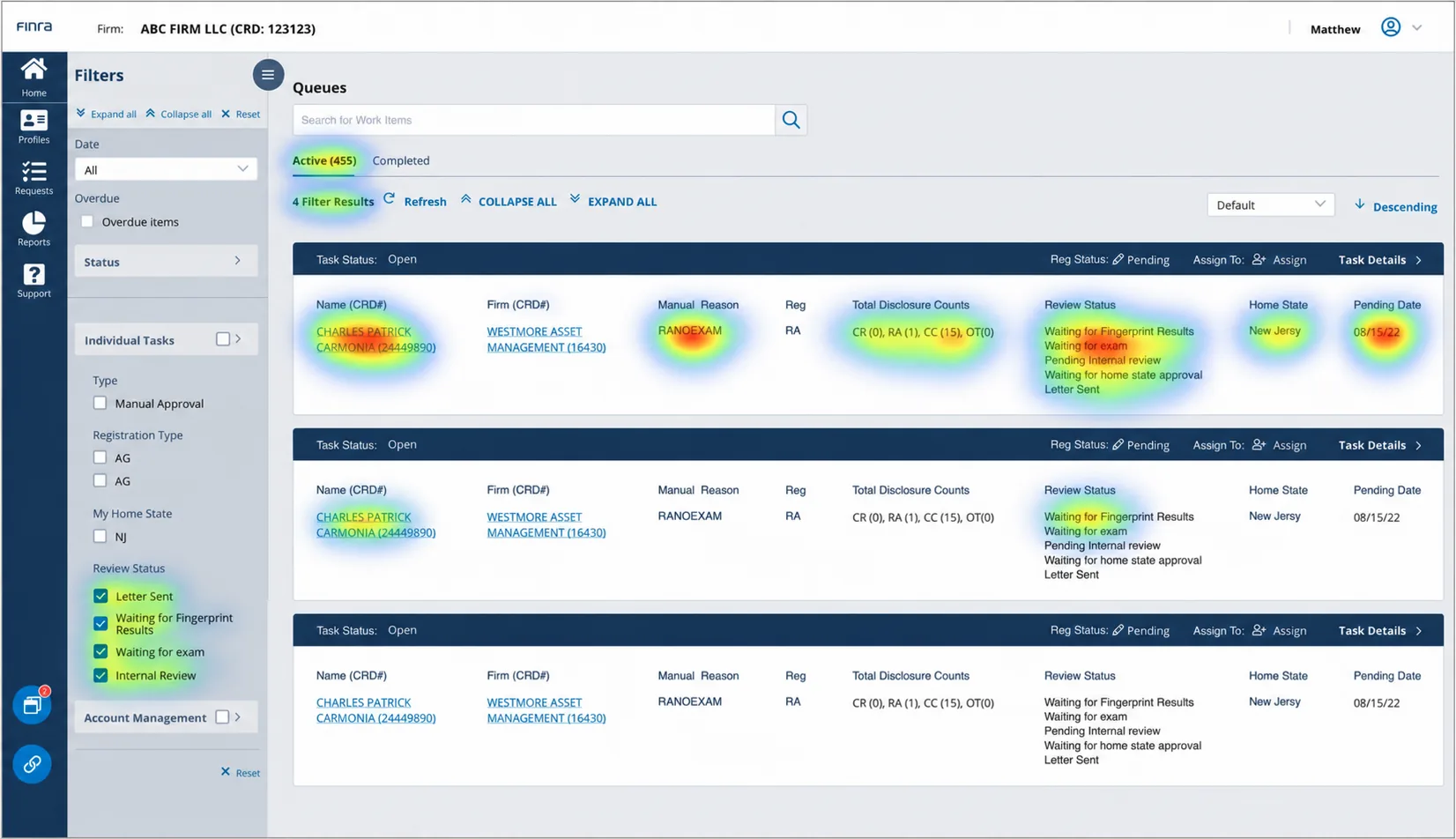
Selective, decision-focused scanning
Two rows interrupted the scan pattern experienced users relied on.
Too much information competed for attention.
Users couldn't tell what went wrong or what to do next.
The queue had to carry urgency, context, and ownership in a single scan: quick enough for a veteran, legible enough for someone in their first month.
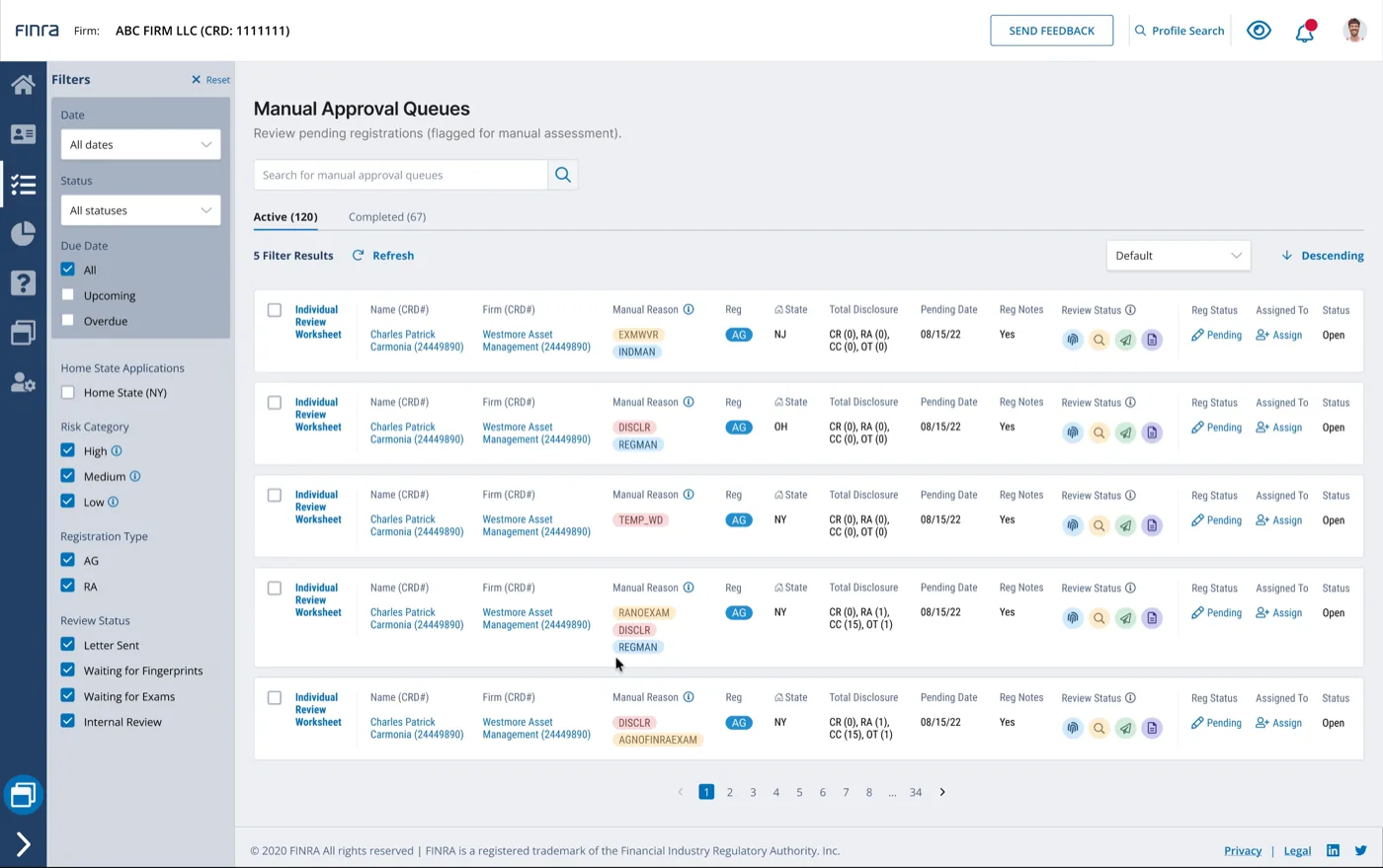
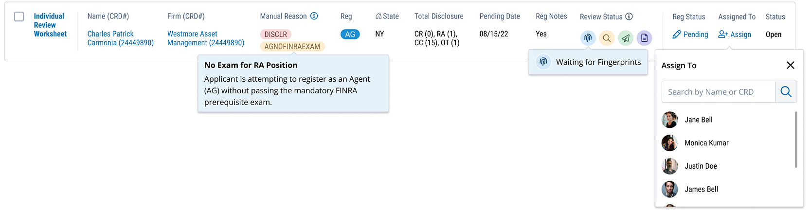
Once a regulator opened a task, everything needed to decide, and to defend that decision in an audit later, had to sit in one place.
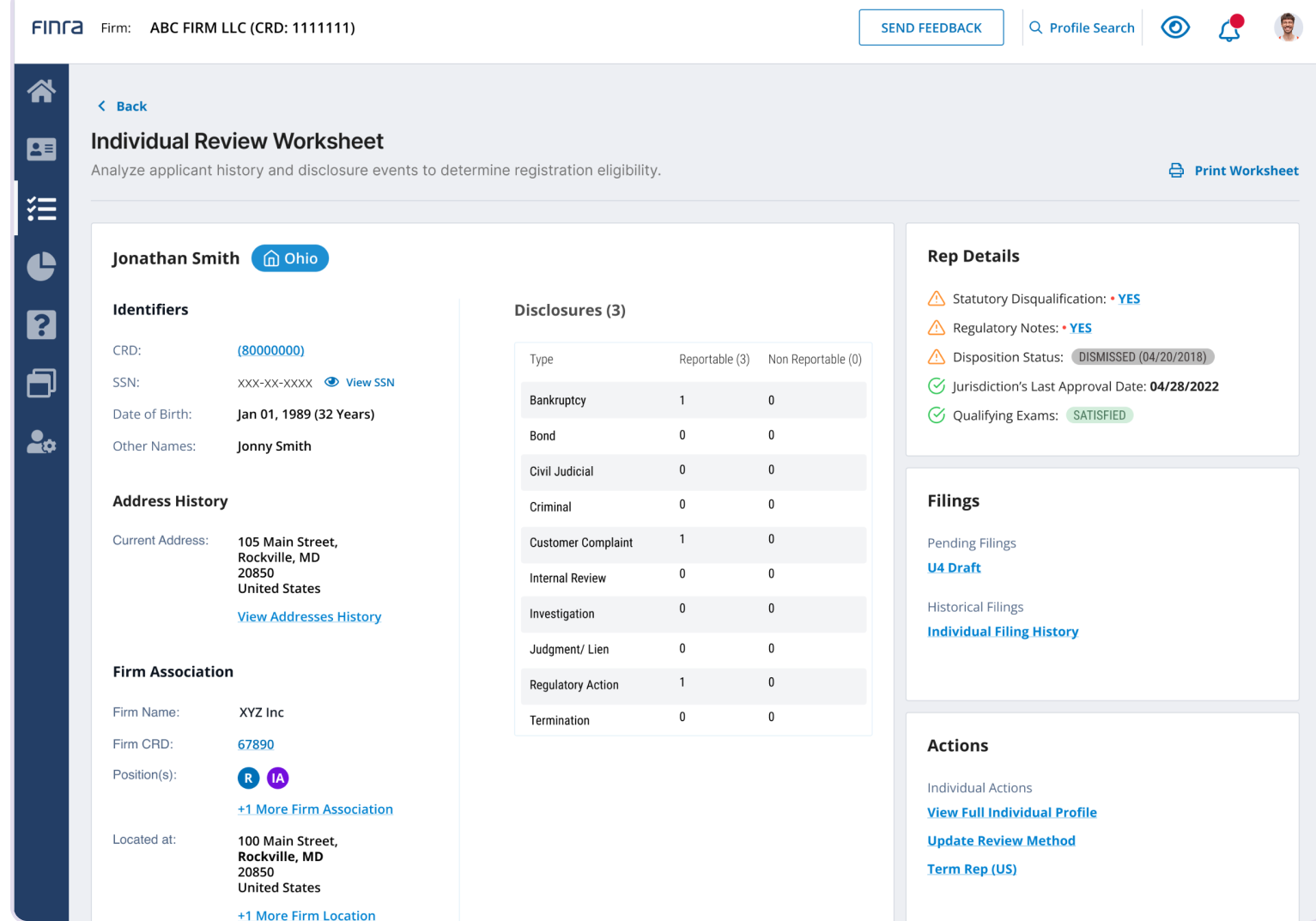
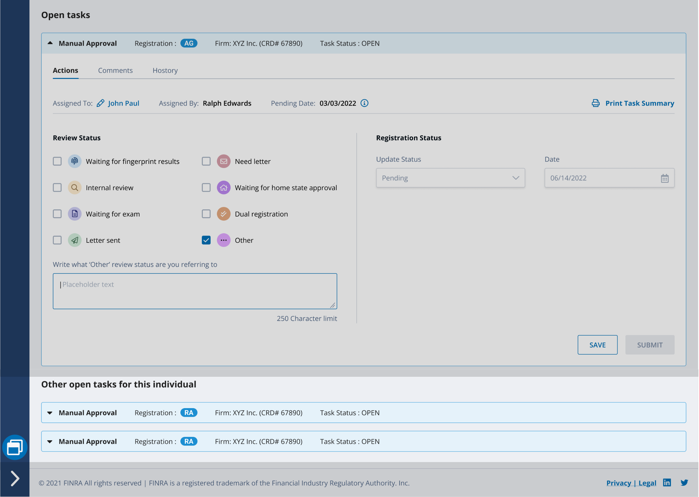
The redesign brought each decision into one task view. Keeping regulators in that view meant designing the whole workflow around it, including the moment a session is about to end. FINRA’s 30-minute inactivity rule stayed exactly as it was; what changed was what the interface told regulators before it applied.
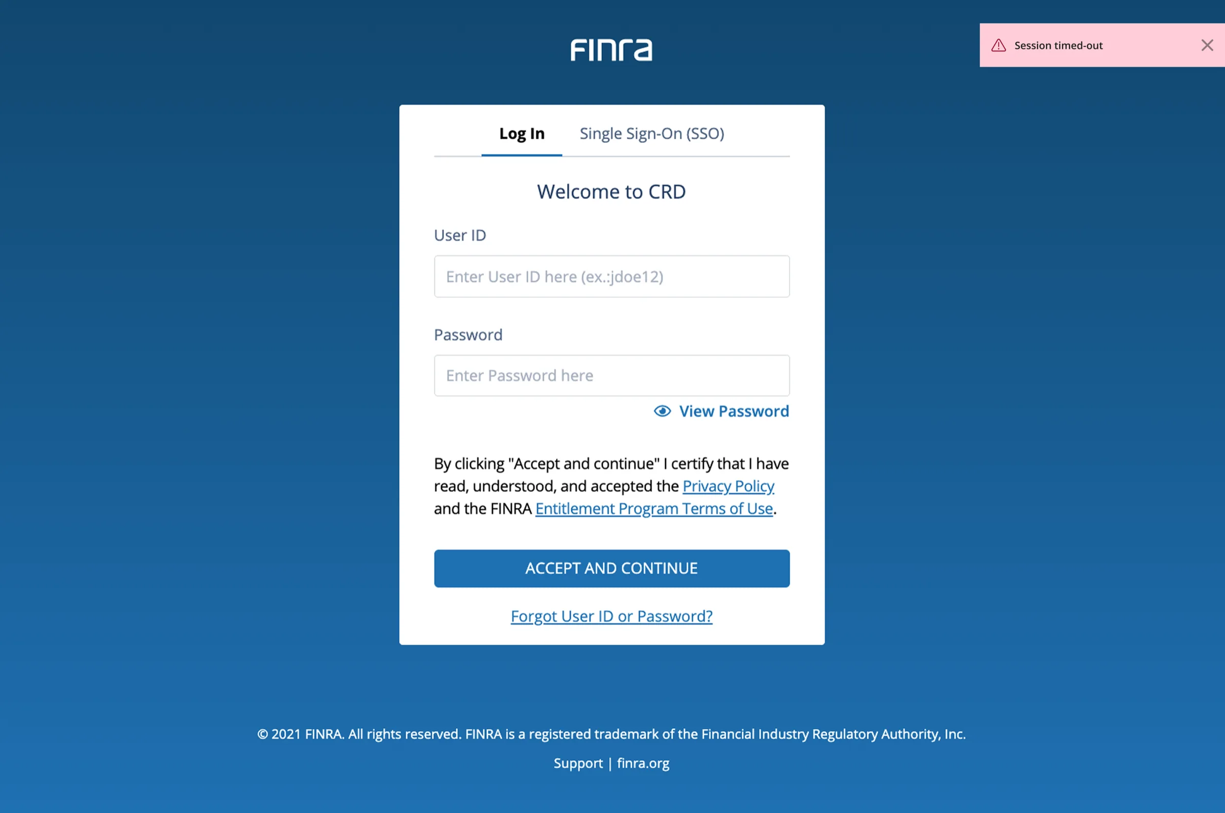
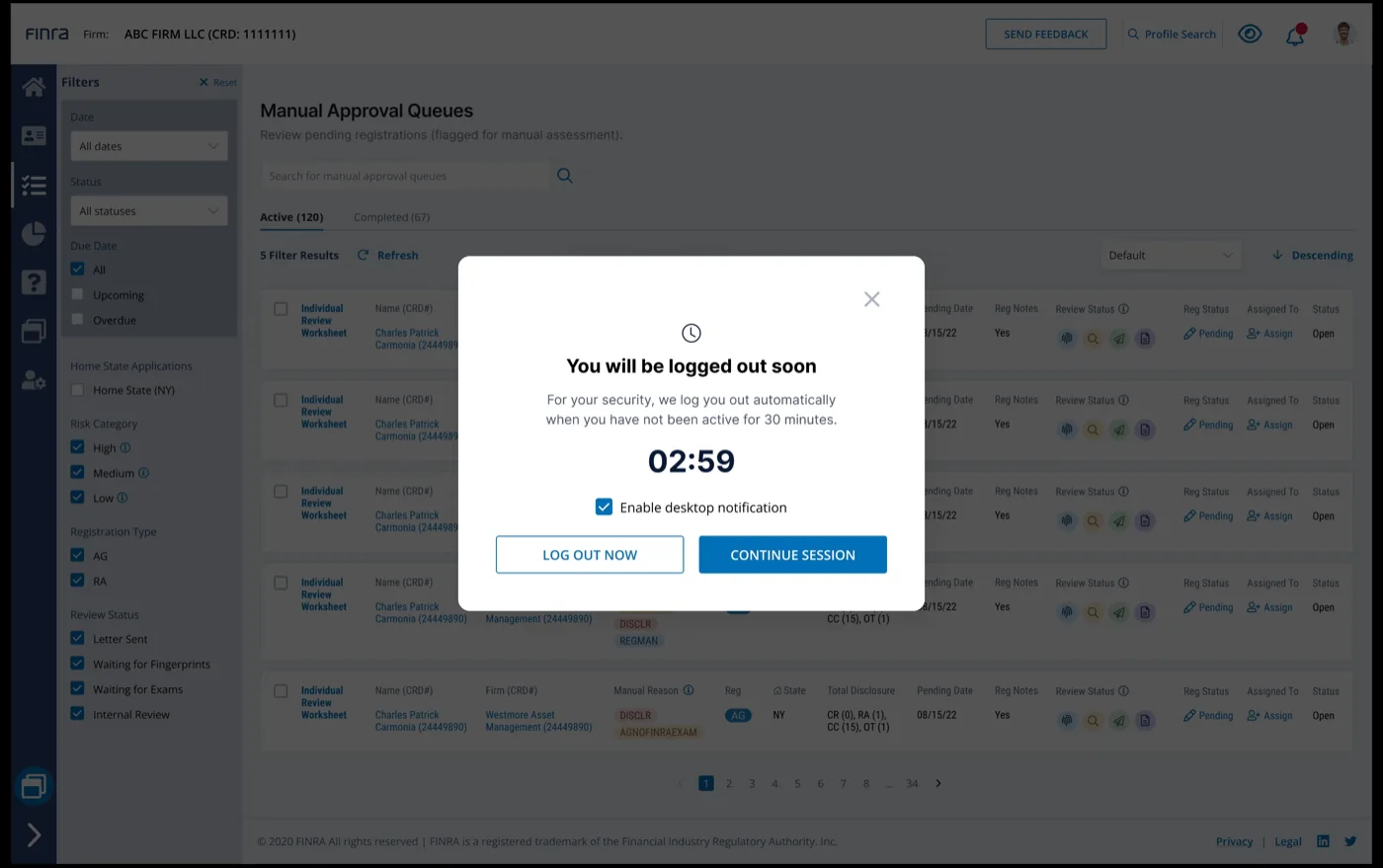
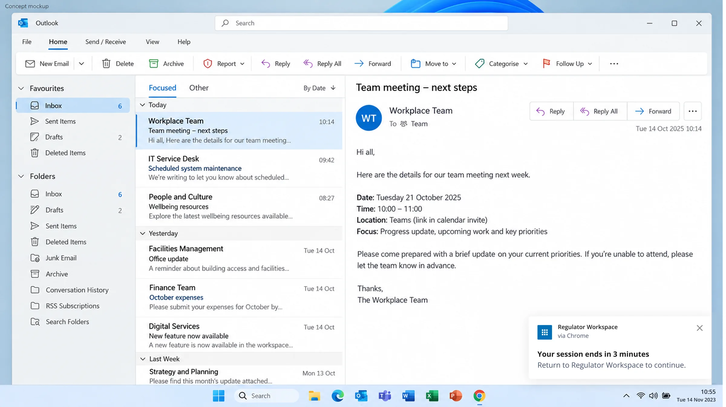
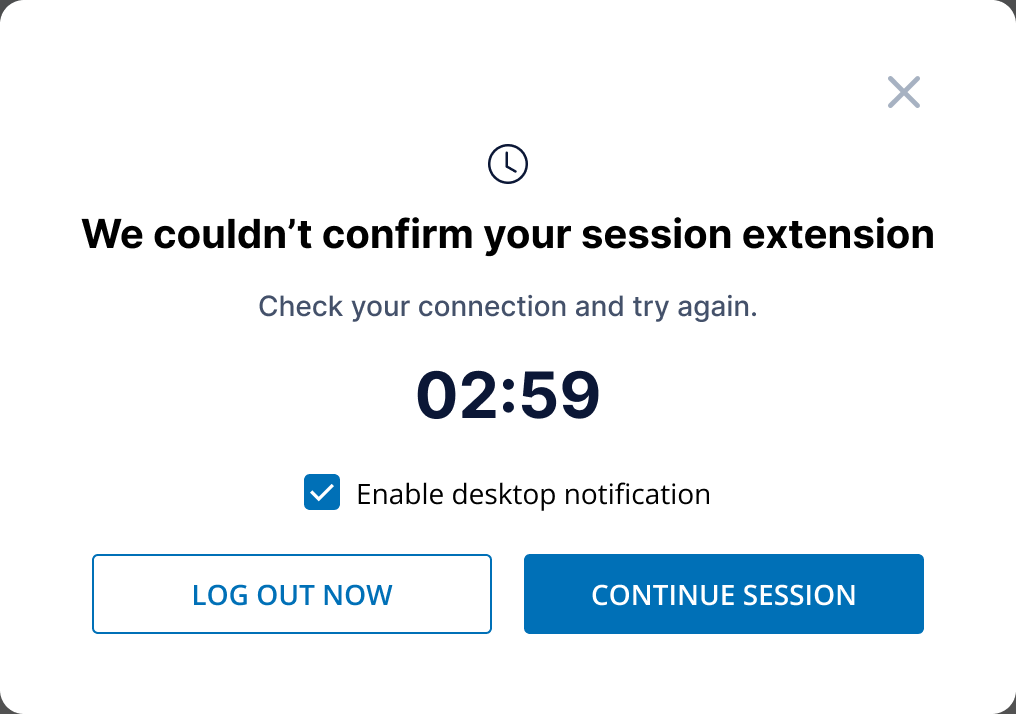
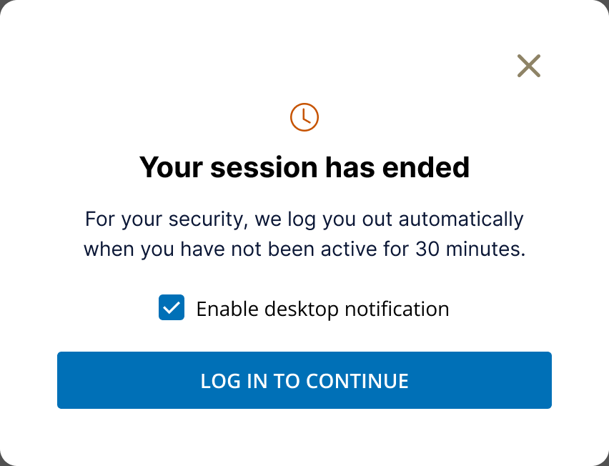
Moderated testing with the same 12 regulators, then a one-day beta. A small sample, not a product-wide rate.
Pre-launch results came from moderated testing with the same 12 regulators. After launch, the team monitored the first renewal season to understand the business effect.
Enterprise modernization is not a visual-cleanup exercise. It is a prioritization problem: understand where decisions break down, choose the highest-leverage surface, and connect every change to an observable outcome.
Capture rationale where the work actually happens.
Preserve scan speed; layer guidance on top.
The right “not now” protected the outcome.